We remember the supplier. Or the catalogue. Or the call where we agreed to review it. We rarely remember which of those contains the detail we need today.
That is an awkward question for a folder tree. A folder can tell us where a document lives. It cannot show the email, person and meeting around it without us opening each module and rebuilding the context ourselves.
We built Micelclaw’s knowledge graph to make that second task visible. It is a map of records and the things they mention, with a way back to the original material. The useful moment is when we stop guessing where to search next and choose a connection to follow.
For this tour we use Paco’s demo account. We begin with a broad map of its existing entities, then follow a fictional BoomClaw supplier example. The supplier names, catalogue and business story in that example are demonstration data. The screens are the running product, not a diagram of a feature we plan to build.
Start with the wider map
We open Knowledge Graph from the dashboard’s top bar and choose Entities. For the overview below, we set Limit to 250. That loads a broad mix of people, projects, organisations, places and ideas, with their connections. It is a captured view of this account, not a suggested limit for everyone.
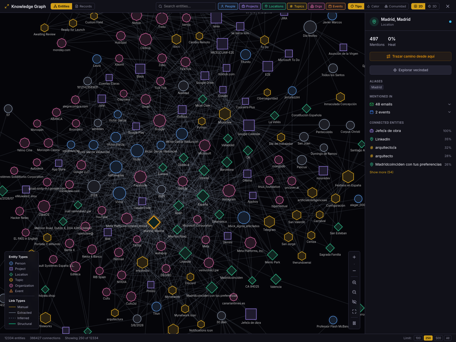
The category buttons let us remove kinds of entities from the view. For a second view, we load 500 and turn off Locations, Events and Topics. The renderer retains 322 nodes. People, projects and organisations become easier to distinguish without reducing the screen to a tiny neighbourhood. Dates and other types without a category button can still appear.
The distinction between loaded and displayed matters: the footer reports the loaded count, while category filters decide which of those nodes are drawn. Neither number describes the whole workspace.
Start with something we recognise
Our starting point is a note called Donnerschlag Line Import Notes. It sits alongside supplier contacts, catalogue emails, a PDF and a review call. Each belongs in its own module. Together they describe one piece of work.
To inspect that particular example, we switch to Records, select the note and choose Explore neighbourhood. This deliberately narrows the broad map to the material around one record.
That focused example loaded nine records and fifteen connections. Those numbers describe the earlier record-centred inspection, not the wider entity screenshots in this article, the size of a typical workspace or a performance benchmark.
The point is that we can recognise the work without opening nine tabs. The note is a square, the emails are diamonds, contacts are circles, and the event has its own shape. The legend stays available when memory fails us. We select a record to see its title and connected records in the side panel.
It is still possible to encounter an unexpected neighbour. In our example, a generic image file appears on the edge of the map. That is a reason to inspect a connection, not quietly turn every line into a confident story.
Two ways to ask what is connected
The Entities and Records buttons answer different questions.
Entities are extracted names and concepts: a person, organisation, place, project or topic mentioned in our content. This view helps when we remember an idea but not the record that contains it. The selection panel can group the records that mention the selected entity by module.
Records are the actual things we can open: notes, contacts, emails, events, files and other supported records. This is the view we use for the Donnerschlag example because the note is a concrete starting point.
A record connection can come from an explicit link, or from entities the records share. The distinction matters. An explicit reference says that someone deliberately connected the material. A shared name says that it may be useful to examine the records together. It does not say that their statements agree.
The record legend separates Direct link from Shared entities. We do not need to understand the storage behind those labels to use them, but we do need to resist reading more into a connection than it contains.
Open the record behind the dot
Selecting our import note gives us a View note action. That is the escape hatch from the map back to the module that owns the content. A graph would be frustrating if it showed an intriguing title and then made us search for it again.
The connected-record list is another way to inspect the same neighbourhood without hunting for a small shape on the canvas. We can choose a related record, change focus or open the original material when we need its details. The graph helps us choose the next document; the document is where we check what was actually said.
That last step is deliberate. The visual arrangement does not tell us whether the catalogue is current, whether the supplier replied, or whether anyone approved a purchase. To answer those questions we still have to read the relevant records. A useful map reduces the searching, not the responsibility to check.
Follow a path, without inventing one
Back in the wider 250-entity view, we select a starting node, arm the path action and choose a destination. The canvas highlights the route in amber and fades the surrounding map. In the capture below, the actual route is Micelclaw → Microsoft → NVIDIA: two hops, three nodes. That is a path through extracted connections, not evidence of a business relationship between those organisations.
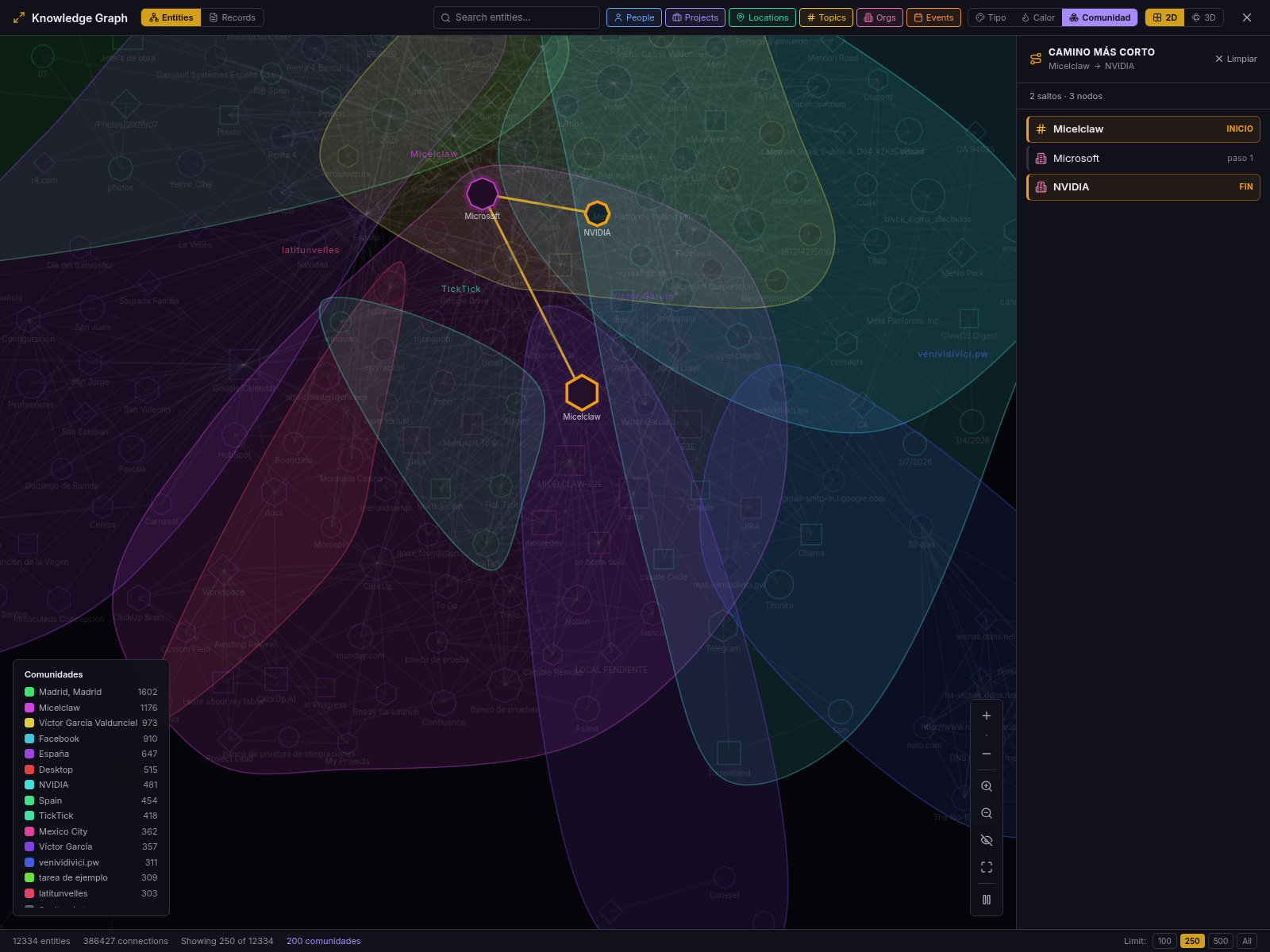
The separate fictional note-to-review-call example has a direct path: one hop, two records. We do not add intermediate steps to make it look more impressive. The path panel lists what the loaded graph actually contains, giving us specific places to inspect.
The current path calculation only uses the subgraph that is loaded in the browser. If the view says there is no path, it means no path was found in that loaded set. It is not a declaration that nothing in the whole workspace connects the two records. Increasing the node limit or exploring a different neighbourhood can change what is available.
We also have a neighbourhood control that narrows the loaded view by distance from a selected node. That is helpful when the canvas becomes crowded, but it shares the same boundary: it works on the graph already loaded, not a promise to fetch every possible connection.
The same map, with depth
The 3D button changes how we look at the graph. It does not create another set of relationships. For this capture we keep the same 250 loaded entities and choose community colours, then move through a view that can be orbited and zoomed.
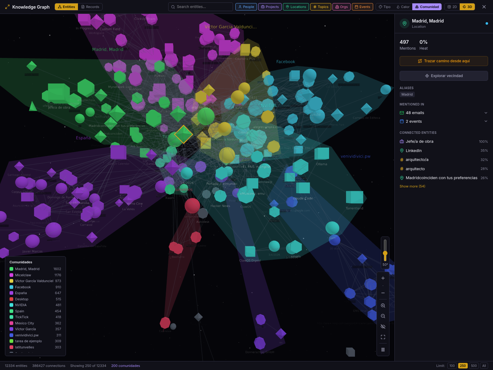
Depth helps us separate overlapping shapes and see the map from another angle. Sometimes the flat view is easier to read; sometimes rotating the scene gives us a clearer separation. We can choose either without changing the underlying question.
Colouring by community offers another way to inspect the map. A community is a group of connected material; its colour helps us see the group, without declaring that its members agree. We keep today’s tour on categories, communities, paths and the two spatial views. The activity heat map deserves its own follow-up.
We keep these controls alongside the map because one arrangement cannot make every kind of work readable. The useful view is the one that helps us identify the next record, not the one with the most dramatic camera angle.
Why the AI gets references before content
Underneath the screen, Micelclaw exposes read-only graph tools for a map, an entity’s mentions, its neighbours and explicit record links. Their responses are compact references: a domain and record identifier, a title and a small amount of ranking information. They do not copy whole record bodies into every graph response. This lets an authorised agent orient itself, follow a useful reference and then request the original record through that module’s read tool. The graph lives alongside the records in our self-hosted system; using an external model remains a separate provider choice and follows the agent’s permissions.
That is the behaviour we want from an assistant: find the likely sources, read the relevant ones, and tell us what supports the answer. We verified the graph interfaces for this article; the screenshots are a dashboard tour, not a captured conversation demonstrating that an agent solved the catalogue question. We do not want to disguise a possible workflow as a completed demonstration.
What it doesn’t do yet
The graph is an index of connections, not a source of certainty. Extracted names can be imperfect, records can be missing from a loaded view, and a shared entity can bring together material we would not personally group.
There are also rough edges in the current build. During this review, exploring one organisation in Entities mode produced a single-node view even though the organisation showed mentions. The record-centred neighbourhood used above did load its connected material. We show that verified route rather than suggesting every entity-centred view is already equally reliable.
The interface currently mixes English with some Spanish control labels. Our captions explain those actions in English; the captures preserve what the product displayed. The 3D view requires WebGL and falls back to 2D when it is unavailable. Graph access and agent tools depend on the configured product tier and permissions; having a graph on screen does not grant an agent unrestricted access to the records behind it.
The takeaway
We no longer have to remember only where a record was filed. We can begin with the part of the work we recognise, follow its connections and open the source that deserves a closer look.
That is what makes the graph useful: it gives us a next step we can check.
Next up: a closer look at the graph’s heat map—what activity makes stand out, and why activity is not the same as importance.